Fish & Zeleniš
Authentic Mediterranean Cuisine
Services:
Consumer Research, Brand & Comms Strategy,
Social Media Strategy, Identity Design,
Merch Design, Illustration, Copywriting
Authentic Mediterranean Cuisine
Services:
Consumer Research, Brand & Comms Strategy,
Social Media Strategy, Identity Design,
Merch Design, Illustration, Copywriting
For two decades, Fish & Zeleniš has been one of Novi Sad’s most vibrant places – an authentic restaurant with a Mediterranean meraki soul.
Though widely known for its honest cuisine, arty atmosphere, and unpretentious spirit, twenty years of heritage also shaped a perception among newer audiences that it’s a place “for special occasions.”
We approached the anniversary as a chance to reaffirm the brand’s original position by celebrating the vision it was built on:
Hedonism as an everyday attitude – not a planned or occasional spectacle.
To move the brand away from exclusivity and bring it back into the realm of everyday closeness, connection and spontaneity – the communication needed less ceremony and more life.
The anniversary identity shaped as a series of postage stamps and “souvenir” stickers became an homage to everything that defines the Mediterranean spirit and the brand’s core message.
From the stamp form and illustration style, to the colors, messages, and typography, the system highlights everything that keep us relentlessly in“In Love with Life”: nature, freedom of expression, small imperfections, daily delights, and togetherness.
The identity became a visual system, the platform for long-term communication across digital and merchandising channels – not a one-off anniversary mark.
The brand got the voice that rejects predictable restaurant communication, embracing spontaneity, liveliness, and genuine human connection as its guiding principles.


Services:
When Struja, one of Serbia’s leading lighting suppliers and project design companies, approached us, their goal was clear — to elevate their online presence to match their decades of expertise and collaboration with architects and interior designers.
We redesigned their website to bring together elegance, functionality, and precision, creating a seamless experience for professionals exploring lighting systems, catalogs, and project references. The visual direction embraces clean layouts, subtle contrasts, and a light-driven aesthetic, reflecting the brand’s deep connection to the world of illumination.
Built on a responsive and SEO-optimized WordPress framework, the platform delivers clarity, speed, and intuitive navigation, positioning Struja as both a trusted supplier and a strategic project partner.


Coffee Shop
Services:
Website Design & Development,
UX/UI Design
Illustration
We enjoyed collaborating with Coffee Roasting Man, a distinctive coffee roaster known for its unique blends and remarkable flavors. Our mission was to craft a digital experience as rich and refined as their coffee.
From seamless navigation to aromatic visuals, we infused the website with the same bold personality that defines their brand. Every interaction and detail was designed to create an immersive, sensory journey for coffee enthusiasts.
We owe a special thanks to Bratislav Milenkovic, whose incredible illustrations gave the project an extra layer of vibrancy and character.
The final product is a visually stunning and user-friendly website that celebrates the art and flavor of Coffee Roasting Man. It’s a space where coffee lovers can dive into the story behind every blend while enjoying a delightful online experience.
Grab a cup and dive into the world of Coffee Roasting Man


Where Tech Meets Earth
Services:
Visual Identity, Branding System,
Motion Design, Art Direction
When Algoloam, a visionary company creating architectural wall systems, approached us, their ambition was clear: to build a brand that fuses advanced algorithmic design with raw, sustainable materials—primarily loam.
We developed a visual identity that reflects this unique intersection of tech and nature, where geometric precision meets organic growth. The result is a modular identity system that evolves naturally—just like the product it represents.
Every detail, from typography to motion, was crafted to express the harmony between innovation and earth. A brand that doesn’t just communicate a product, but an entirely new way of building.
This collaboration is a tribute to the beauty of biomaterials, computational creativity, and the future of architecture rooted in tradition.


Food court
Services:
Naming, Tagline, Visual identity,
Logo design, Branding, Copywriting,
Illustration, Landing page design,
Animation, UX, UI
Our mission was to create a powerful and distinctive brand identity for a fast food venture in Phuket, Thailand, with a vision for regional franchise expansion. The client envisioned a brand that would redefine fast food by embracing a fresh, healthy, and innovative approach — breaking away from the typical conventions of the industry. This new identity needed to stand out boldly against established giants like McDonald’s and KFC while remaining firmly within the fast food category.
The challenge was twofold: first, to position the brand as a healthier and more appealing alternative to traditional fast food; second, to craft a design language that could support franchise scalability without losing its unique charm. The goal was to strike a balance between sophistication and approachability, ensuring the brand would resonate with local and regional audiences alike.
To achieve this, we opted for an unconventional design strategy that defied category norms. Instead of relying on typical fast food aesthetics — bright colors, clichéd imagery, and predictable typography — we sought to create a brand identity that would feel fresh, modern, and authentic. Our work began with a deep dive into the client’s vision and values, as well as market research to understand the preferences of the target audience. This research guided us in developing a new brand name that encapsulates the essence of the business: approachable, vibrant, and inherently tied to the concept of health-conscious dining. Alongside the name, we crafted a memorable tagline to reinforce the brand’s promise and appeal.
Central to the brand’s visual identity is a bespoke logo, built around custom typography that exudes personality and sophistication. The logo serves as a bold statement of the brand’s uniqueness while maintaining simplicity for versatility across various applications. We complemented the logo with an illustration style that adds a playful, human touch to the brand. These illustrations became key visual elements, featured prominently on packaging, in-store materials, and communication assets. The combination of clean, modern typography and charming illustrations created a cohesive aesthetic that distinguishes the brand from its competitors.
The visual identity was further extended across a range of deliverables, including:
Animation was integrated to bring the brand to life online, adding an engaging layer to the digital experience. Whether it’s a subtle logo animation or an interactive illustration, these details contribute to a cohesive and modern digital identity.
The result is a fast food brand that disrupts expectations and sets a new standard for the category. By blending creativity, strategic thinking, and a commitment to quality, we delivered a brand identity that not only stands out in Phuket but also has the potential to thrive as a franchise across the region.


Architecture
Services:
Visual identity redesign, Logo redesign,
Branding, Copywriting, Animation,
Website design, UX, UI
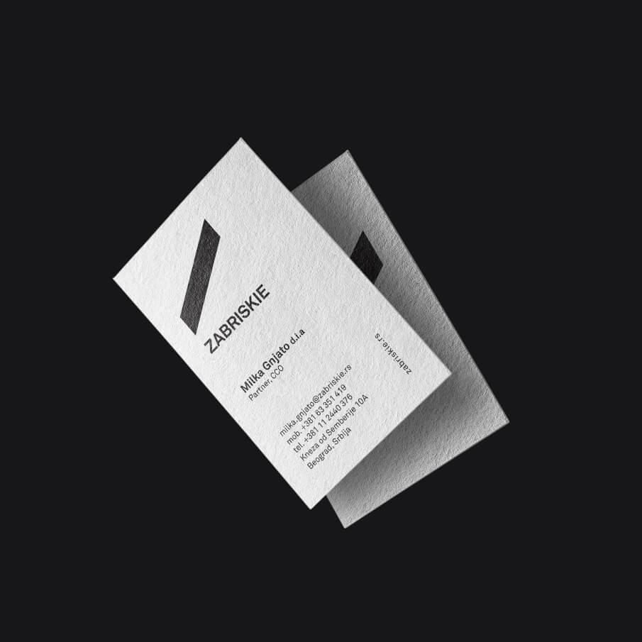
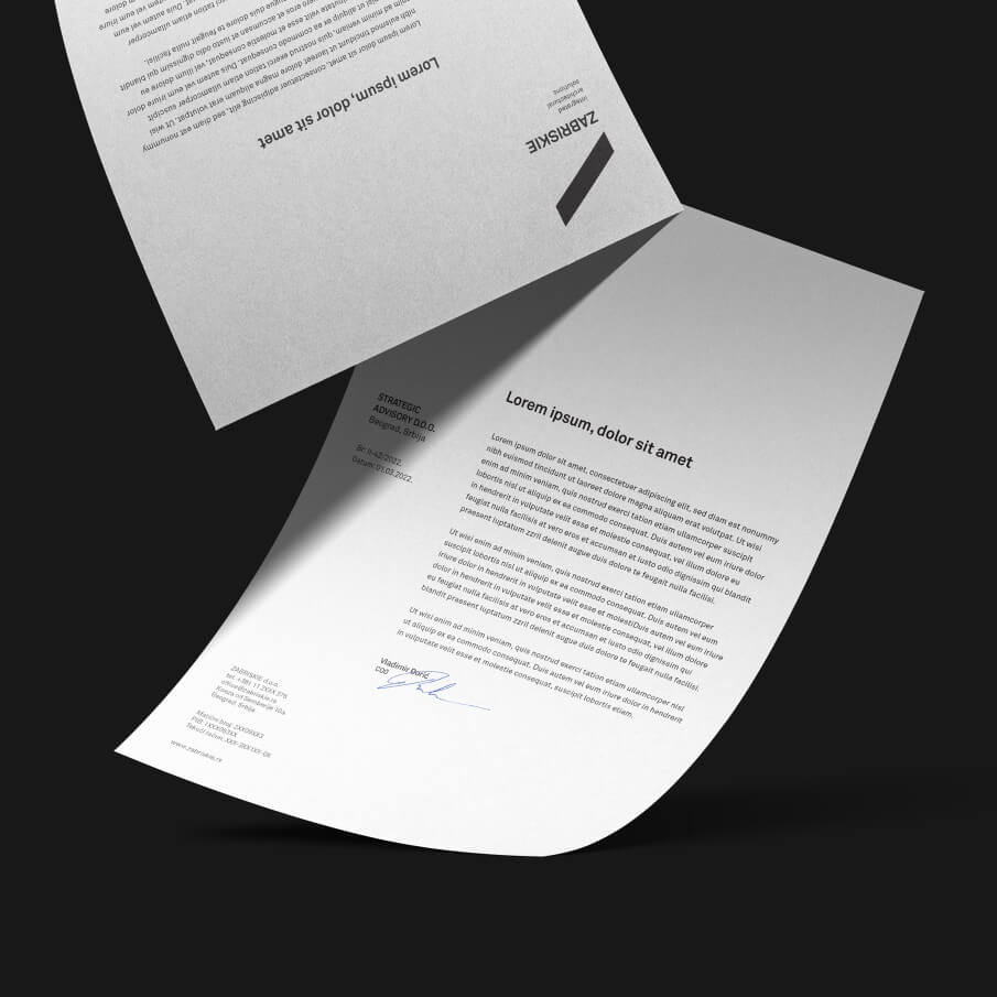
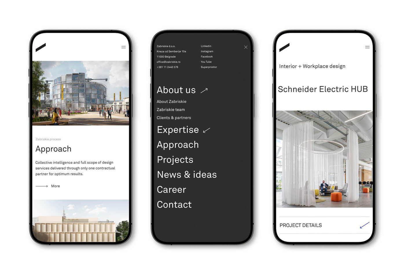
Our objective was to craft a rejuvenated brand identity and develop a responsive portfolio website for Zabriskie – Integrated Architecture Solutions. The goal was to establish a modern, minimalistic design that reflects their vision while enhancing user experience. Through a combination of thoughtful rebranding and intuitive digital solutions, we helped Zabriskie solidify its position as one of the leading architectural firms in the region.
Zabriskie – Integrated Architecture Solutions is a multidisciplinary practice based in Belgrade, founded by a team of seasoned professionals. Their mission is to create comprehensive designs that achieve a harmonious balance between sustainability, aesthetics, and economic feasibility.
The challenge was to seamlessly align Zabriskie’s visual identity and online presence with their core values of innovation, sustainability, and design excellence. The rebranding had to convey their expertise and position them as a trusted authority in the field of architecture. Additionally, the website needed to function as both a professional showcase and a user-friendly platform, allowing potential clients to explore their work effortlessly.
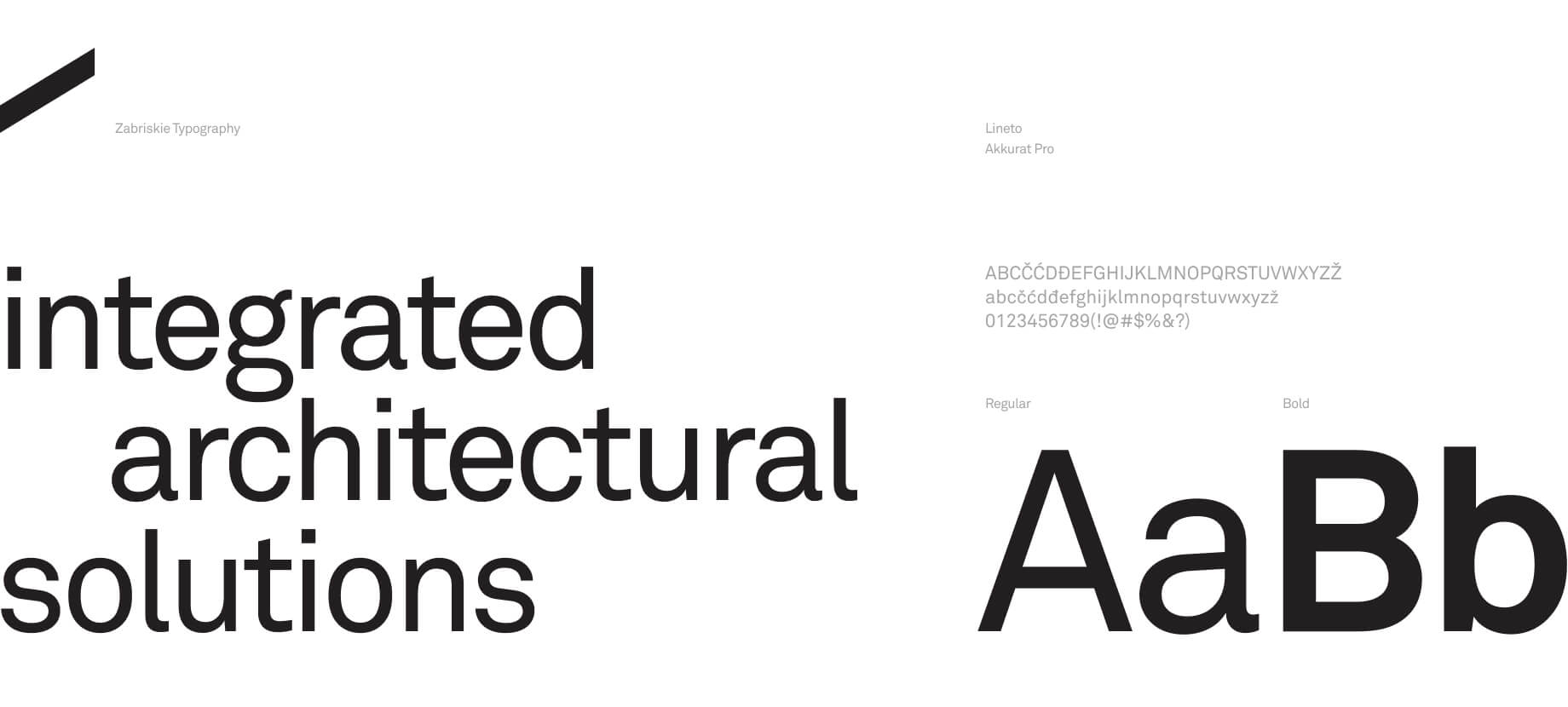
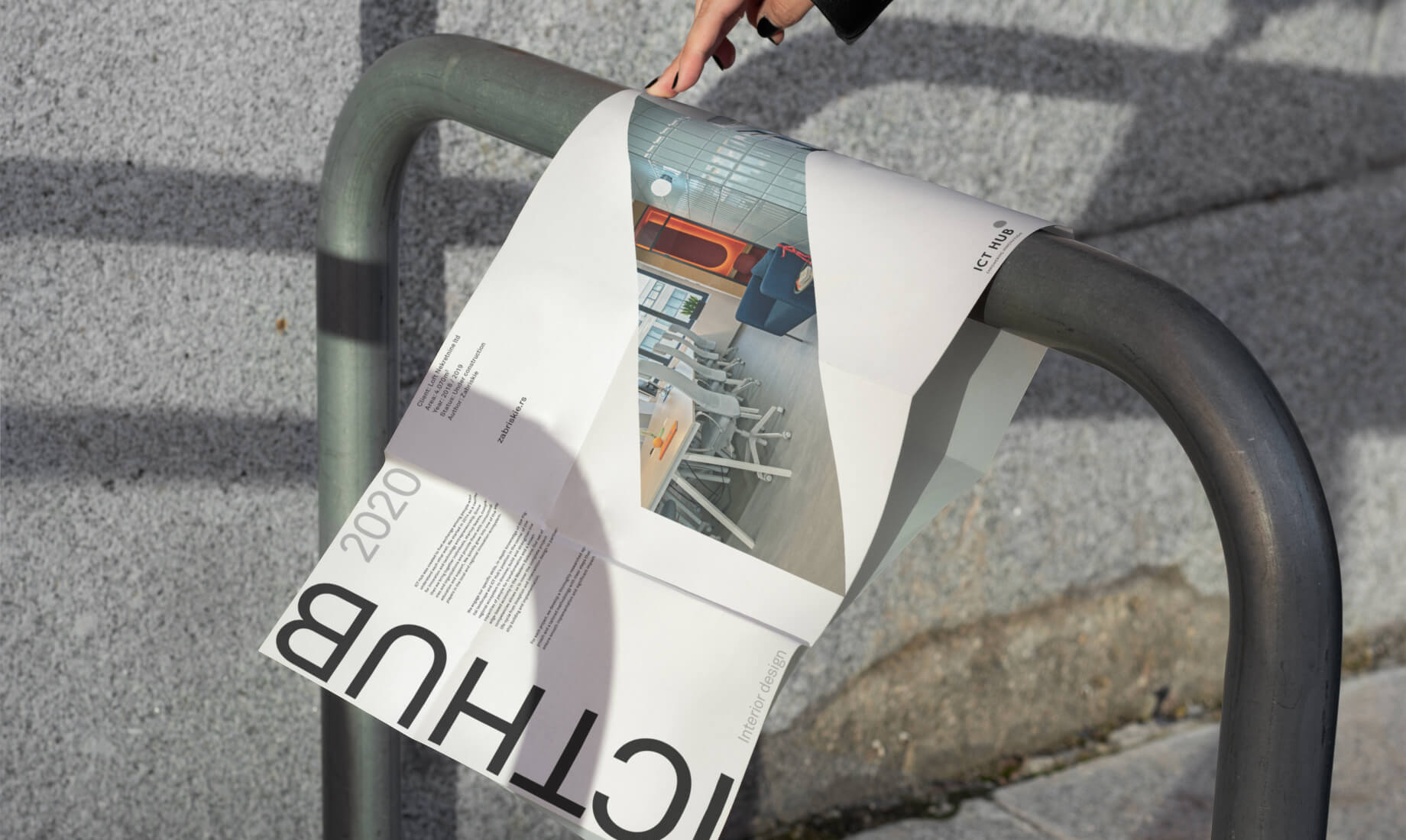
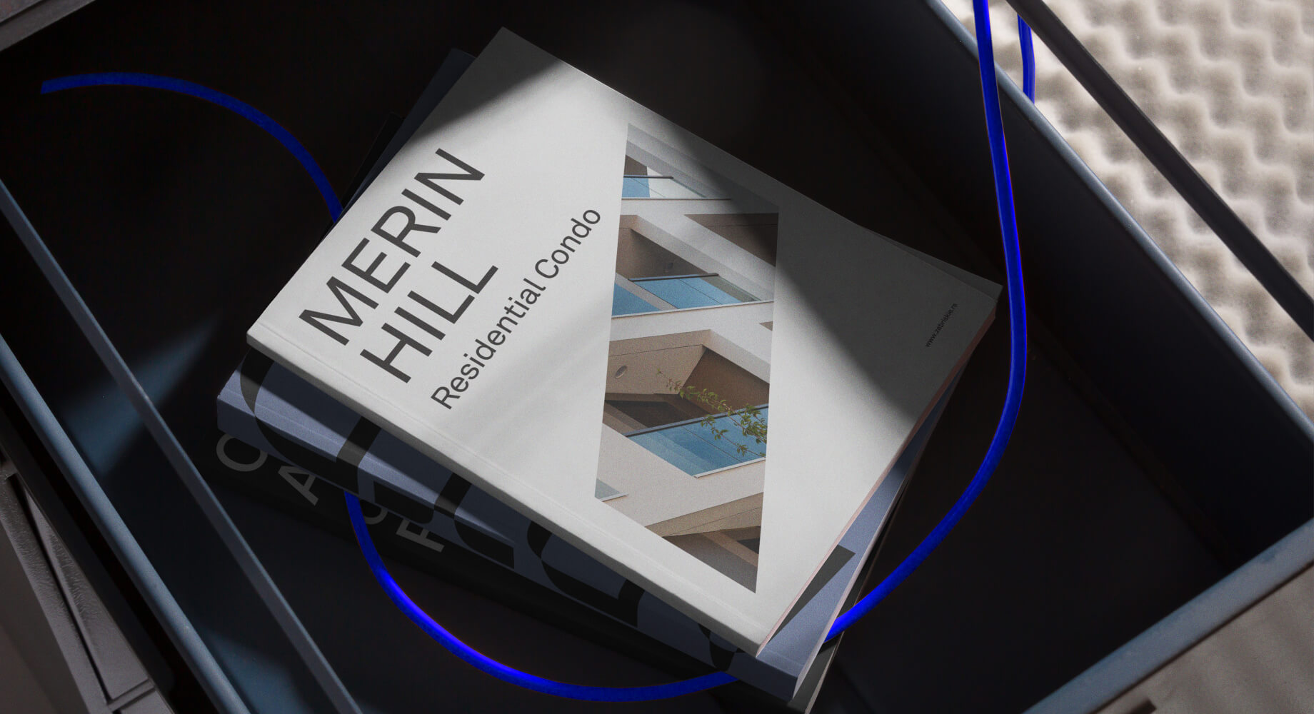
Brand Identity Redesign: We began by reimagining Zabriskie’s visual identity, ensuring it resonated with their multidisciplinary approach and forward-thinking ethos. The updated logo reflects their modern aesthetic, while the refreshed branding system emphasizes simplicity and professionalism.
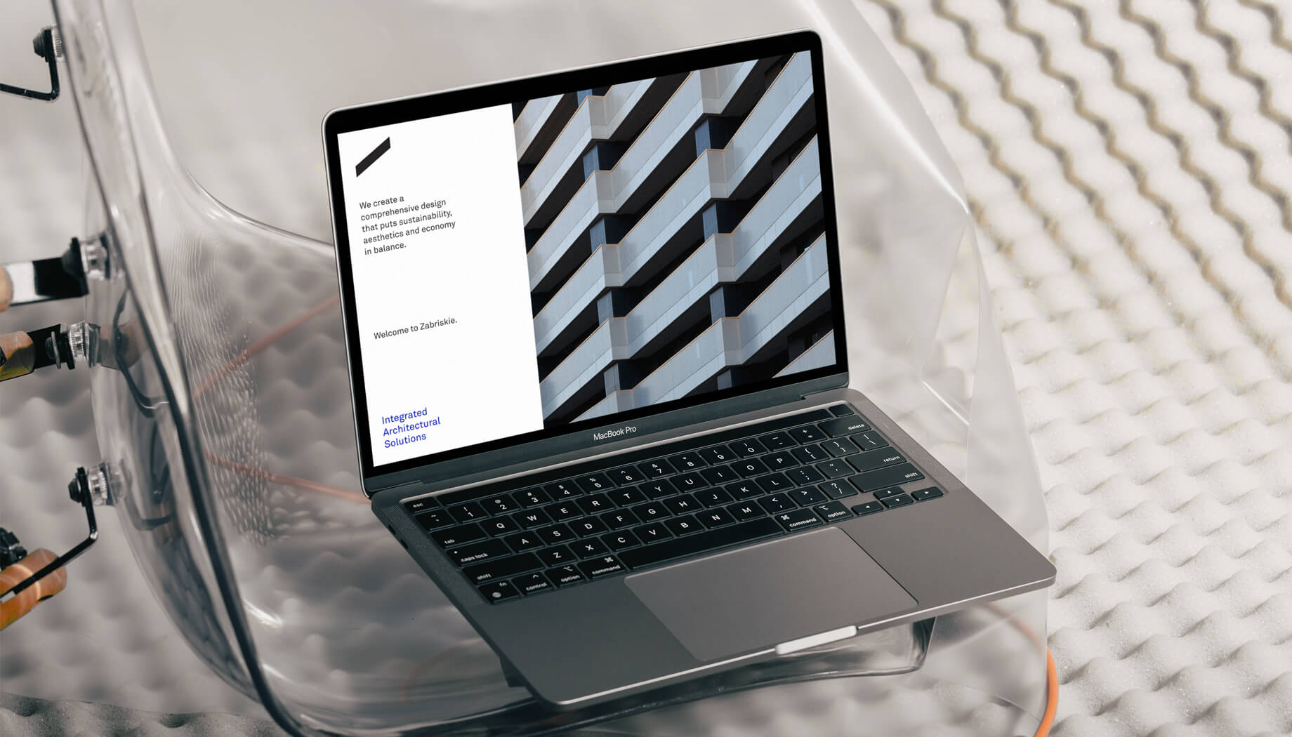
Website Design: The digital aspect of the project focused on delivering a clean and responsive portfolio website. Minimalism was at the heart of our design philosophy, creating a layout that emphasizes Zabriskie’s impressive body of work. Each project is presented with clarity, supported by high-quality visuals and concise descriptions.
User Experience & Animation: To enhance the user experience, we ensured the website was intuitive and easy to navigate. Subtle animations were incorporated to add a dynamic element, bringing the interface to life without overwhelming the design. These animations guide the user’s journey, emphasizing key areas and maintaining engagement throughout their exploration of the site.
The result is a cohesive and modern brand identity that positions Zabriskie as a leader in architectural innovation. The new website not only enhances their online presence but also serves as an effective tool for showcasing their expertise. With a balance of sustainability, aesthetics, and functionality at its core, Zabriskie’s transformation reflects their commitment to excellence in every detail.

Architecture Bureau
Services:
Identity Design,
Website Design,
UX, UI
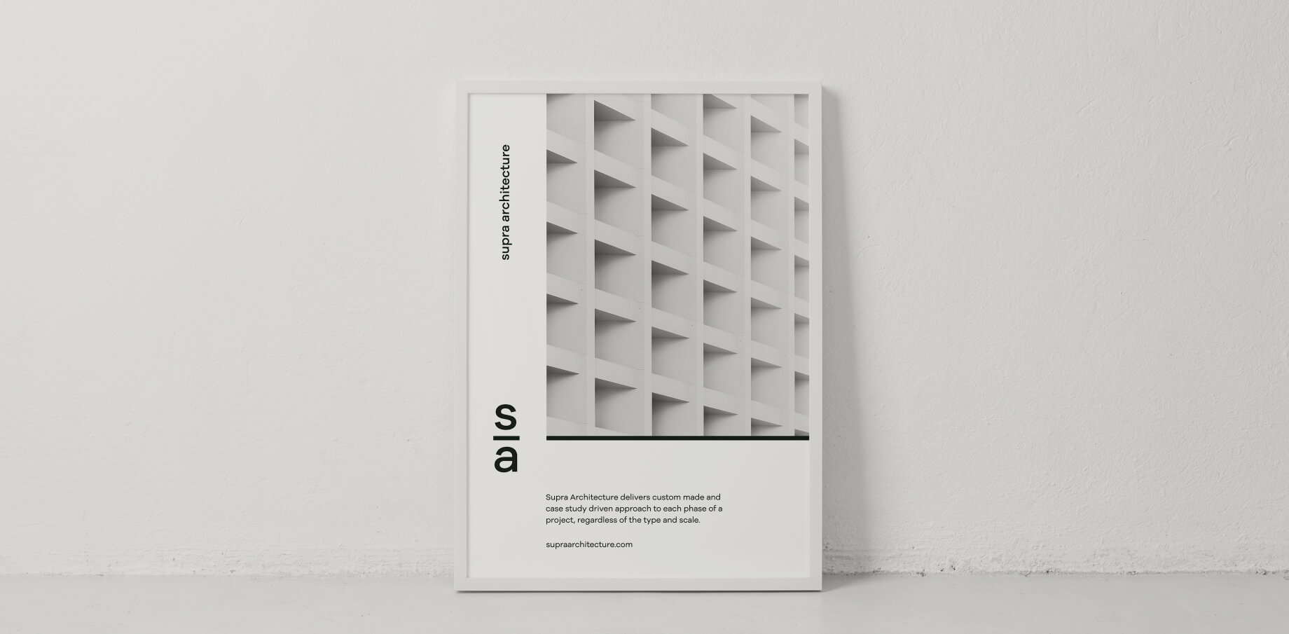
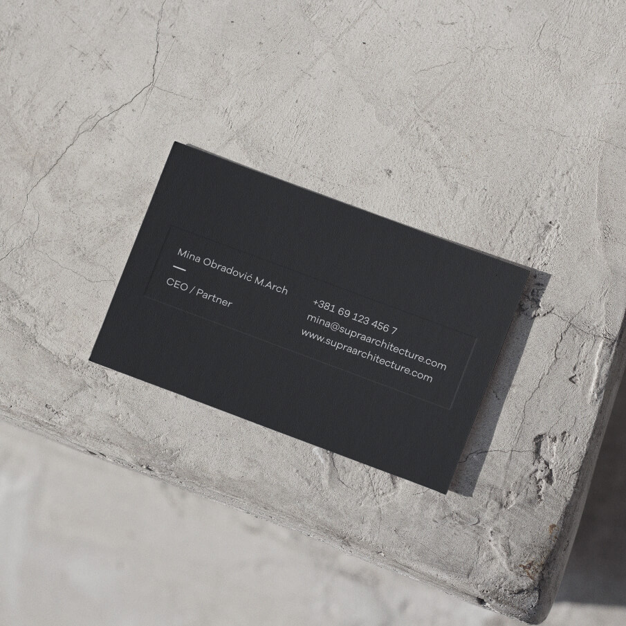
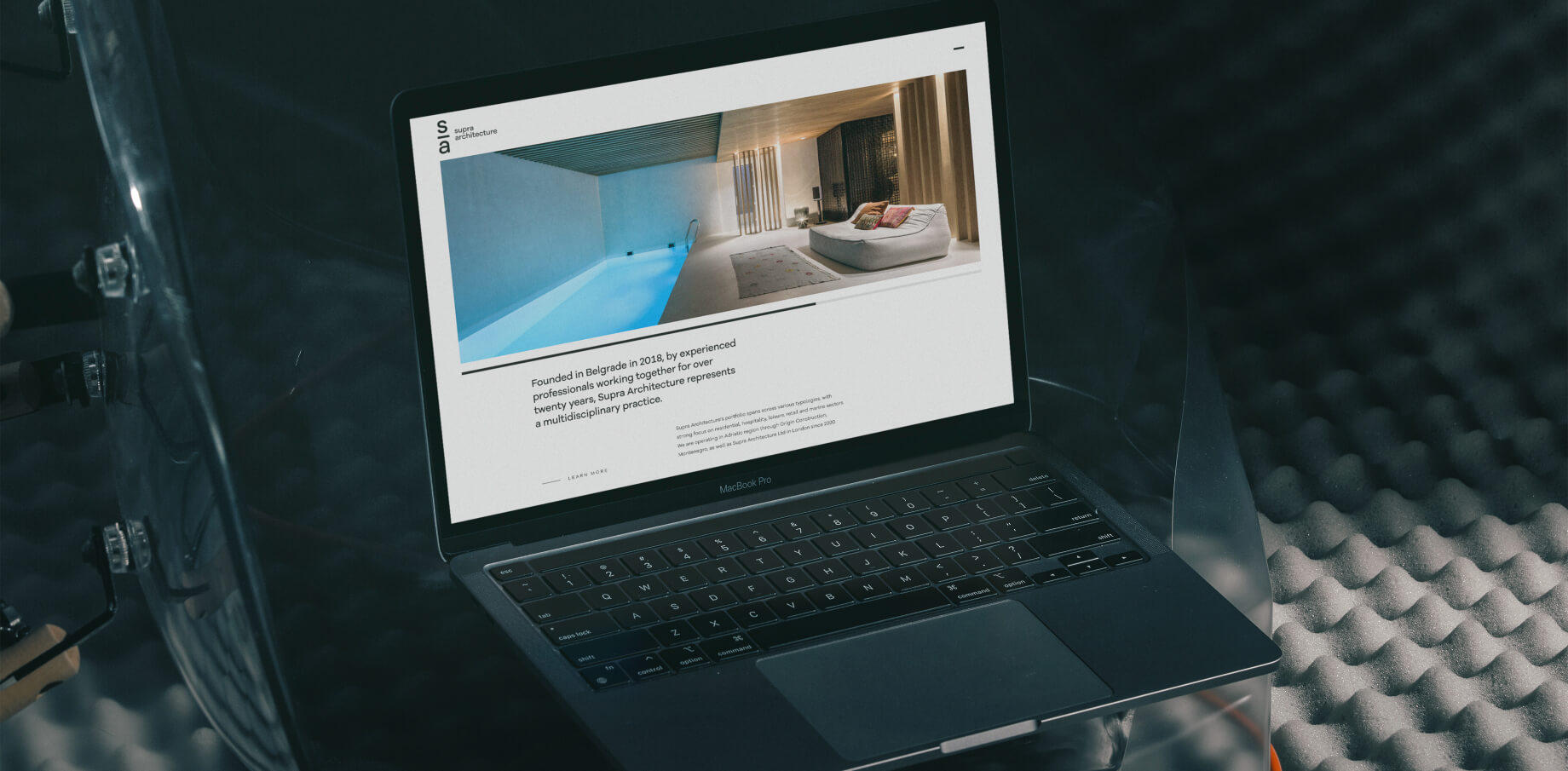
Our task was to craft a fresh brand identity for Supra Architecture and design a responsive portfolio website that reflects their philosophy of innovation and excellence. The goal was to create a unique and minimalistic design that emphasizes usability and enhances the user experience.
Derived from the Latin term “supra,” meaning “above” or “over” (as in supraorbital), Supra Architecture embodies a commitment to elevated design and innovative thinking. Founded in Belgrade by a team of experienced professionals with over 20 years of collaboration, Supra Architecture has evolved into a multidisciplinary practice renowned for its bespoke, case study-driven approach to projects of all types and scales.
Supra Architecture sought a brand identity and digital presence that would reflect their expertise and unique methodology while appealing to a diverse audience of clients, collaborators, and stakeholders. The challenge was to create a cohesive visual language and website that would stand out in a competitive market, reinforcing their reputation as forward-thinking innovators in architecture and design.
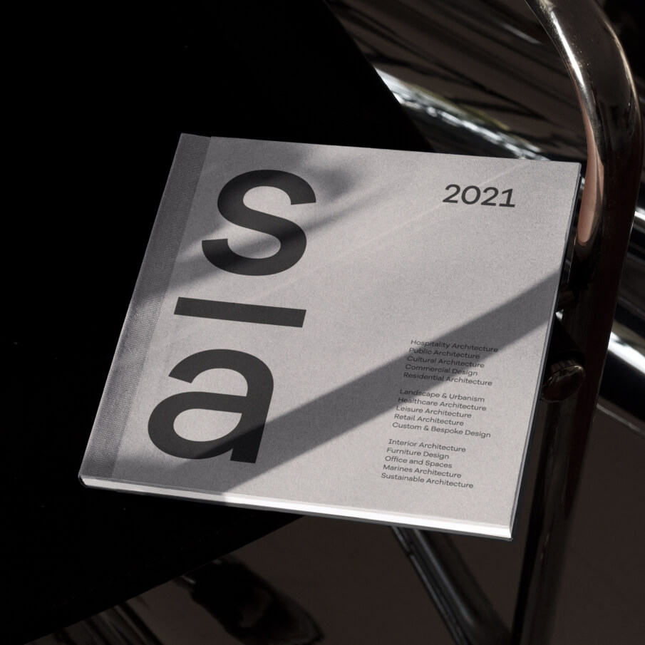
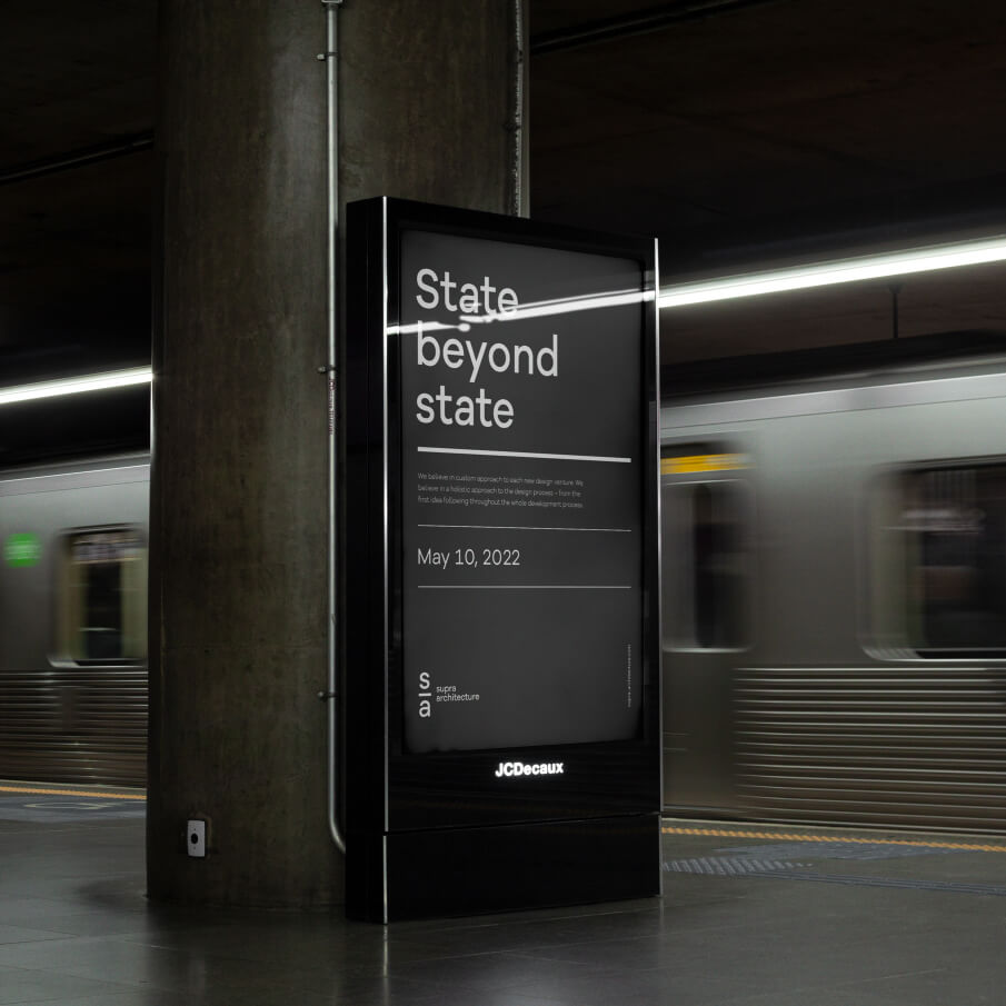
Brand Identity Development: We started by designing a brand identity that captures Supra Architecture’s essence: sophisticated, modern, and timeless. The visual language reflects their multidisciplinary expertise and their meticulous approach to every phase of a project.
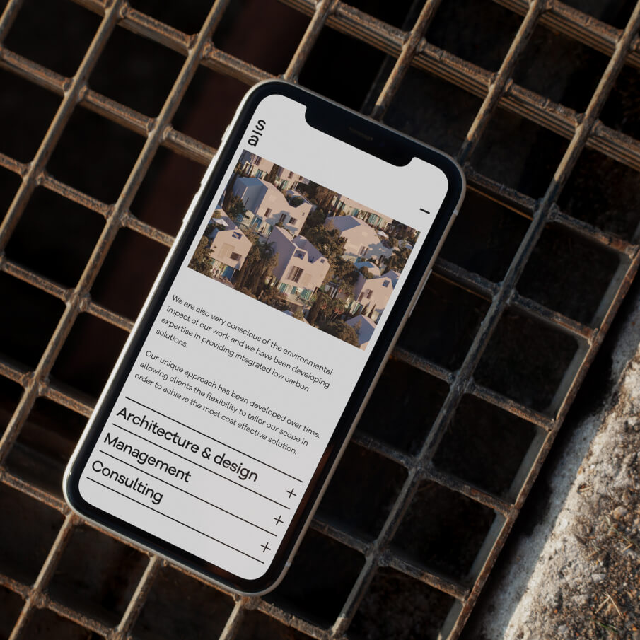
Website Design: The responsive portfolio website was designed with minimalism and functionality at its core. Each aspect of the site was thoughtfully curated to provide an intuitive, seamless browsing experience. Key features include a clear navigation structure, dynamic project galleries, and carefully crafted layouts that highlight Supra Architecture’s diverse portfolio.
Enhanced User Experience (UX): To deliver on enhanced UX, we ensured the website is easy to navigate, responsive across devices, and visually compelling. The minimalistic style allows the content to take center stage, emphasizing the client’s work while guiding users effortlessly through the site.
Custom Project Presentation: Each portfolio entry is tailored to showcase the unique aspects of the project, from concept to completion.
Responsive Design: The site adapts seamlessly to different devices and screen sizes, ensuring an optimal experience for all users.
Case Study-Driven Approach: The design mirrors Supra Architecture’s methodology by presenting their projects as detailed narratives, showcasing their attention to detail and innovative solutions.
The result is a cohesive and modern brand identity paired with a responsive, user-focused portfolio website. Together, these elements highlight Supra Architecture’s commitment to delivering innovative and bespoke solutions, solidifying their position as leaders in the architectural industry.
Chess Academy
Services:
Visual Identity Design, Logo design, Copywriting
Illustration, Animation,
Website Design, UX, UI,
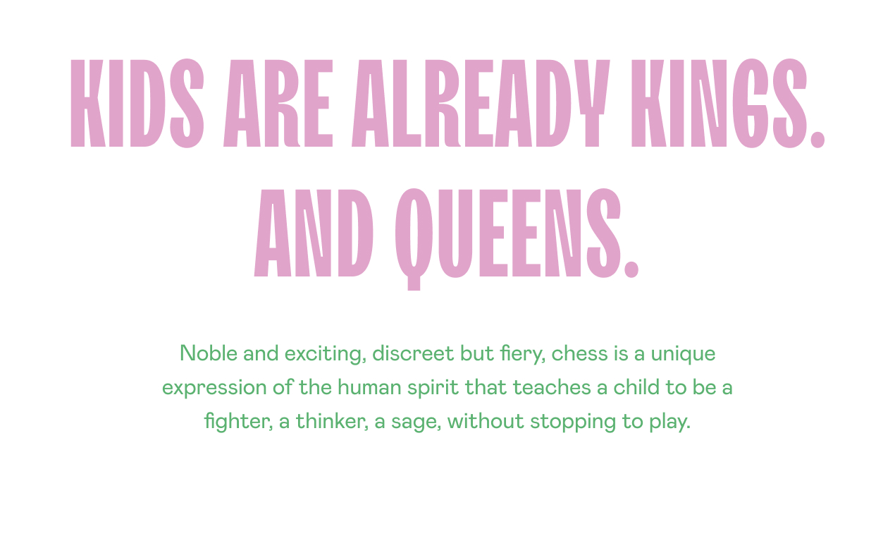
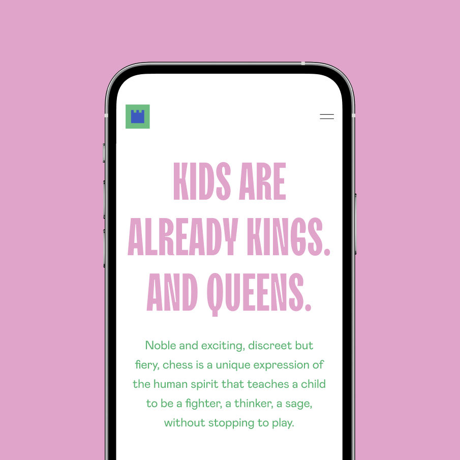
Noble and exhilarating, discreet yet fiery, chess is more than a game—it’s a profound expression of the human spirit. It teaches children to be fighters, thinkers, and sages while preserving the joy of play.
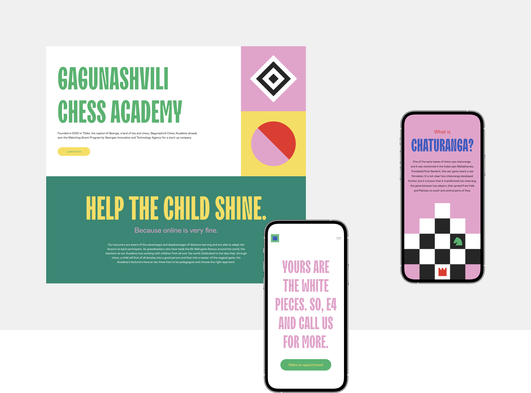
Founded in 2020 in Tbilisi, Georgia—a land renowned for its tea and deep chess heritage—Gagunashvili Chess Academy (GCA) offers online individual and group lessons for children of various ages and skill levels. Taught by world-class grandmasters and passionate educators, the academy brings the magic of the 64-square game to young learners across the globe.
When GCA approached us, their goal was clear: to develop a new visual identity and a custom website that would capture the essence of chess while emphasizing its educational and personal growth benefits for children. They wanted an identity that was playful yet sophisticated, and a website that would deliver a seamless, engaging digital experience for their global audience.
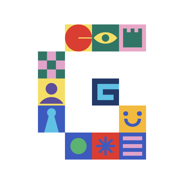
Visual Identity Design: We created a cohesive visual identity system that embodies the elegance and excitement of chess. Central to this is the logo—a dynamic emblem designed to serve as the core imagery for GCA’s branding and communications. Inspired by the game’s iconic elements, the logo is both striking and versatile, capable of resonating with children and parents alike.
Playful Copywriting: We crafted the website’s copy in a tone that is playful, inspiring, and approachable, reflecting the academy’s mission to make chess fun and meaningful for young learners. The words invite exploration while highlighting the transformative power of chess as a tool for intellectual growth.
Custom Website Design: The custom website design blends functionality with creativity, ensuring a smooth user experience while captivating visitors with bold visuals and interactive elements. Its structure is intuitive and responsive, catering to diverse devices and audiences worldwide.
Illustration and Animation: To further enrich the visual identity, we developed unique illustrations and a short micro-animation. These elements inject a sense of motion and energy into the digital experience, reinforcing the academy’s vibrant and innovative approach to teaching chess.
The new visual identity and custom website bring Gagunashvili Chess Academy’s vision to life. The vibrant and playful design reflects the spirit of chess, while the intuitive user experience ensures that families worldwide can easily connect with the academy’s offerings. With a brand that’s as exciting and dynamic as the game itself, GCA is poised to inspire the next generation of kings and queens of the chessboard.
Checkmate.
Architectural studio
Services:
Web design, Web development,
UX, UI, Animation,
When 8848, a rising force in contemporary architecture, approached us, they had a clear vision: to create a one-page website that embodied their philosophy of minimalism, precision, and brutal modernity.
We envisioned a digital space where form seamlessly meets function, reflecting the raw elegance and meticulous craftsmanship that define 8848’s architectural work. The design merges simplicity with sophistication, capturing the essence of their bold approach.
The result is a responsive, one-page website that feels as refined as 8848’s architectural designs. The seamless user experience invites visitors to explore the studio’s portfolio in a way that mirrors the precision and elegance of their work.
This collaboration is a celebration of the power of simplicity, precision, and the shared pursuit of modern excellence.


Financial & Consultancy Services
Services:
Identity Design, Branding,
Website Design & Development,
UX, UI
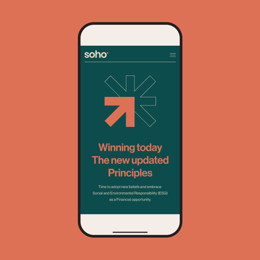
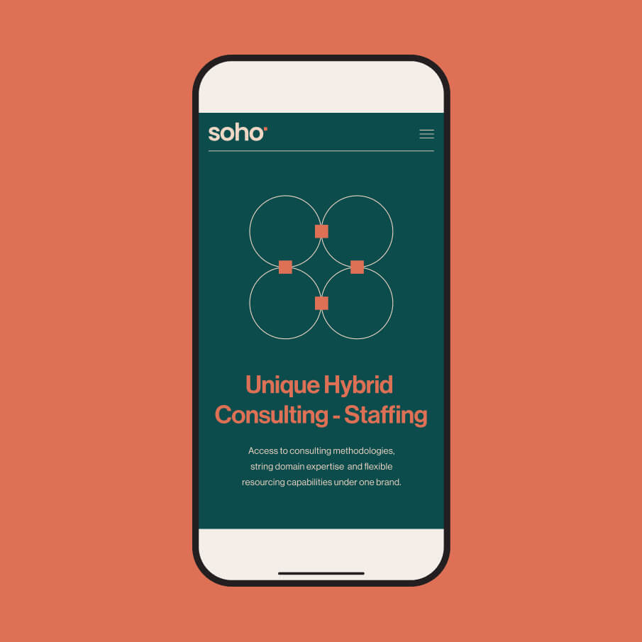
Based in New York, Soho Square Solutions specializes in financial regulatory compliance, business analysis, and corporate and investment banking project implementation. Renowned for their expertise in delivering tailored solutions, they approached us to redesign their visual identity and digital presence, ensuring it reflects their position as leaders in the financial services industry.
The firm sought a brand refresh that would convey their modern, innovative approach while maintaining the professionalism and trust essential in their field. Their visual identity and website needed to balance sleek, contemporary aesthetics with clarity and functionality, appealing to both their corporate clients and internal stakeholders.
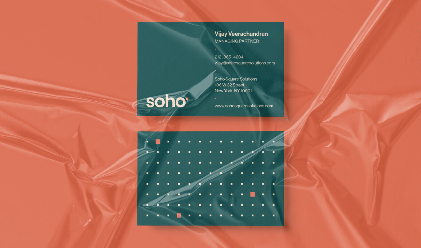
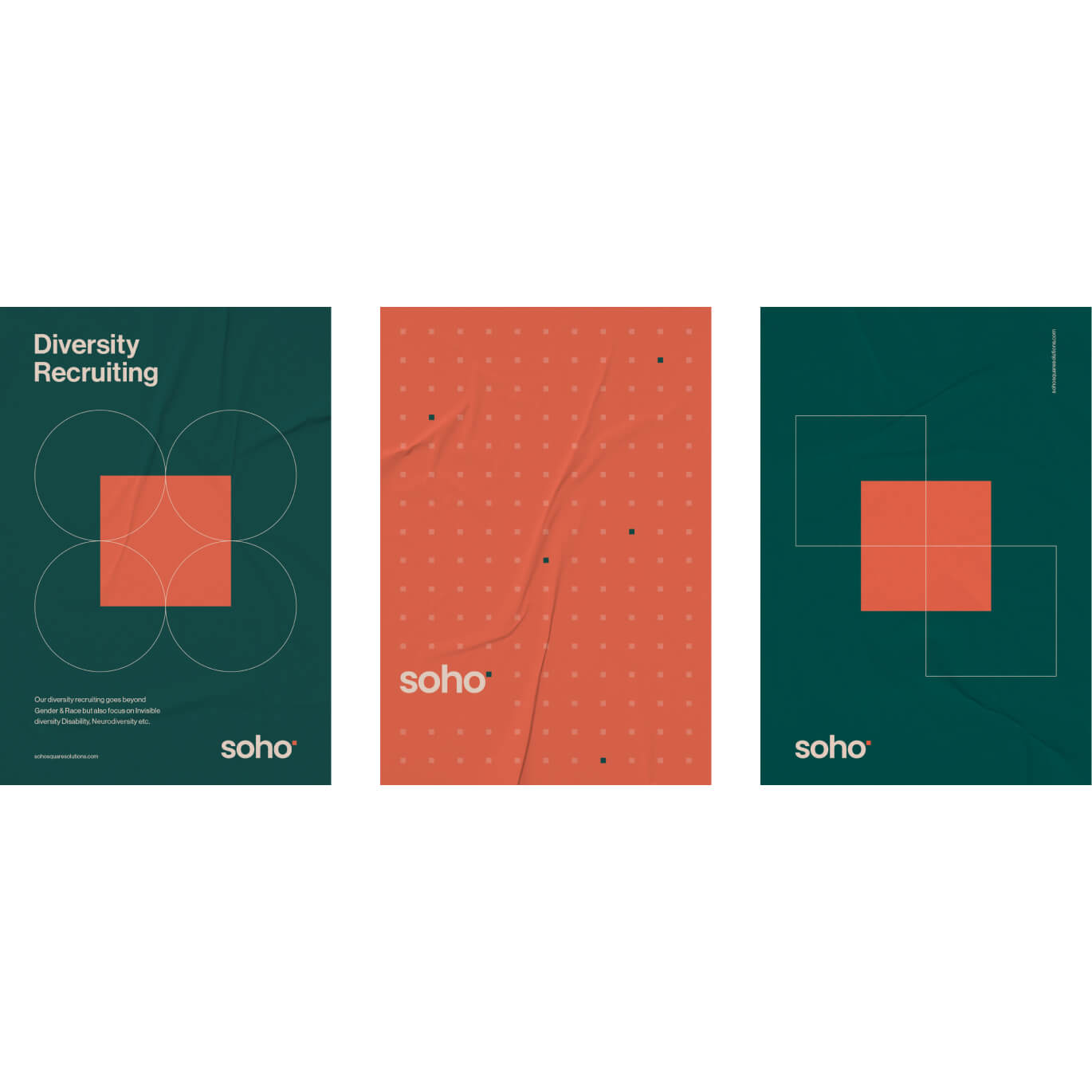
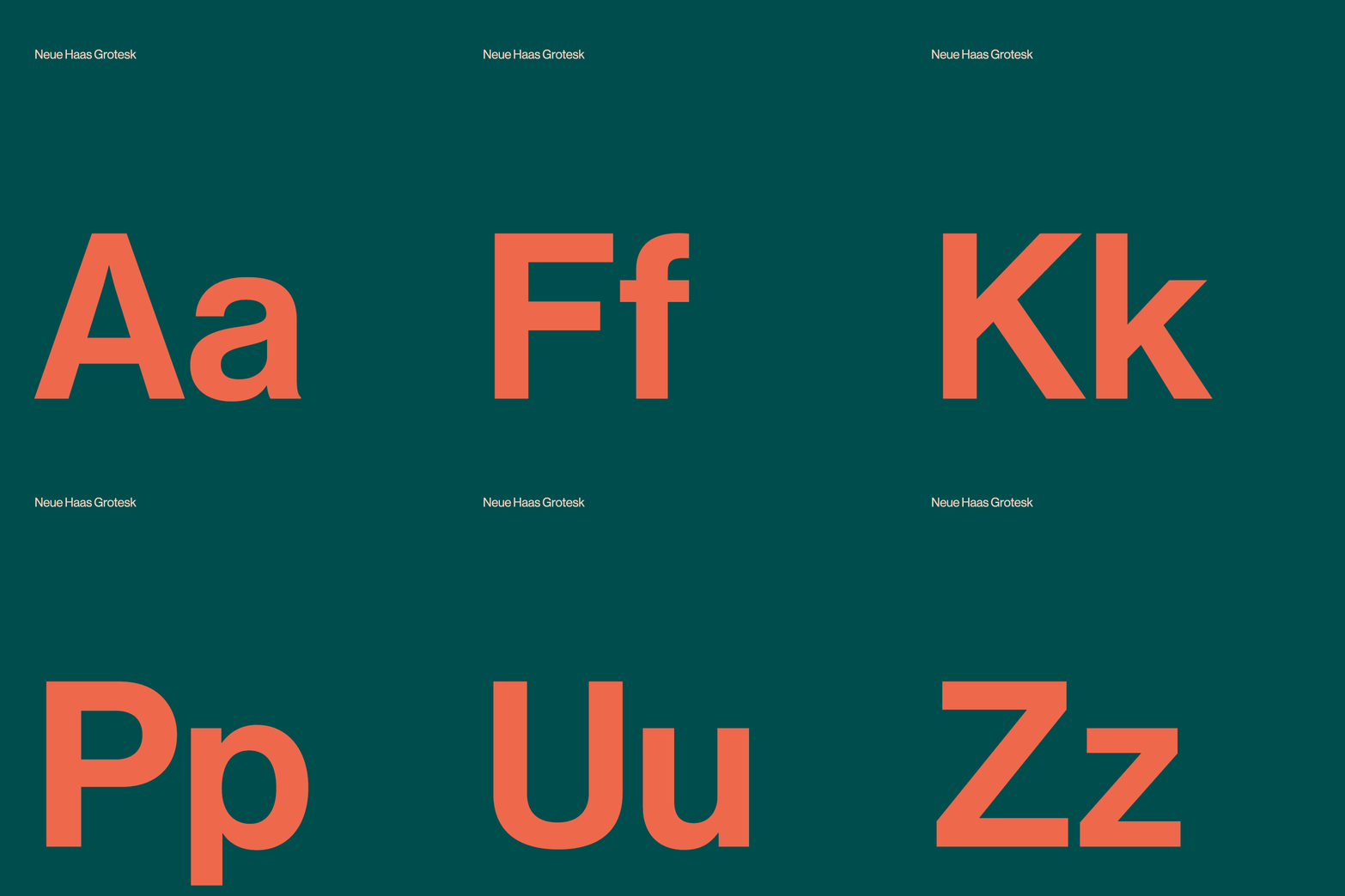
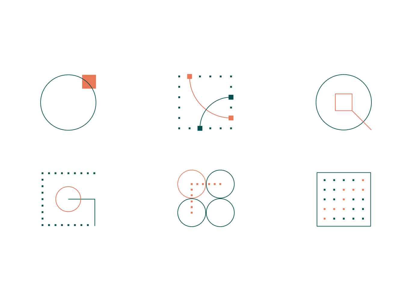
Visual Identity Redesign: We created a refined and cohesive visual identity that reflects Soho Square Solutions’ expertise and forward-thinking ethos. A modern color palette, clean typography, and bold graphic elements were introduced to give the brand a contemporary edge while preserving its professionalism.
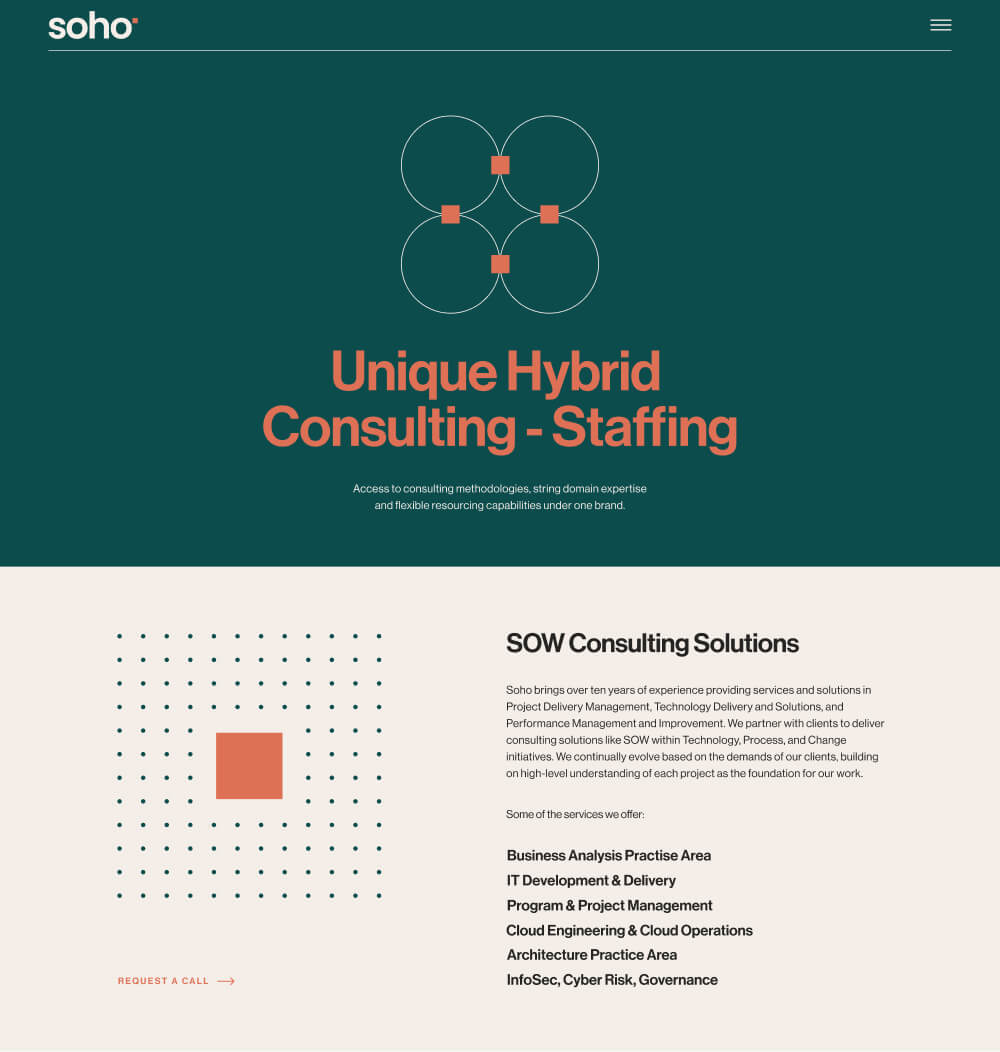
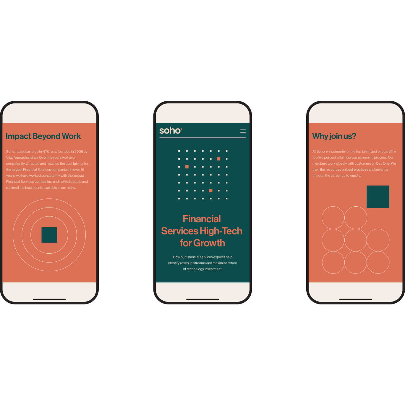
Custom Graphics and Illustrations: To strengthen brand recognition and versatility, we developed a comprehensive set of graphics, illustrations, and icons. These assets were designed for both internal and external use, ensuring consistency across all communication channels—from presentations and reports to the website and marketing materials.
Website Redesign and Development: The website was reimagined as a dynamic and user-friendly platform. Featuring intuitive navigation and responsive design, it effectively communicates the firm’s services, expertise, and value proposition. The site’s structure ensures seamless access to key information, catering to the needs of their diverse audience.
The rebranding of Soho Square Solutions resulted in a polished and modernized visual identity that aligns with their leadership in the financial services industry. The redesigned website and custom assets strengthen their communication and position them as trusted, forward-thinking experts in their field.
Platform for Architecture and Design
Services:
Identity Design,
Website Design,
UX, UI
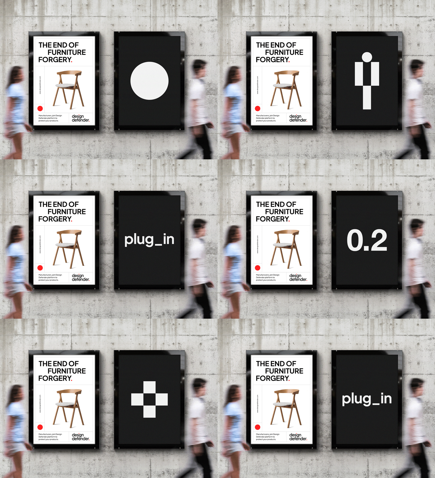
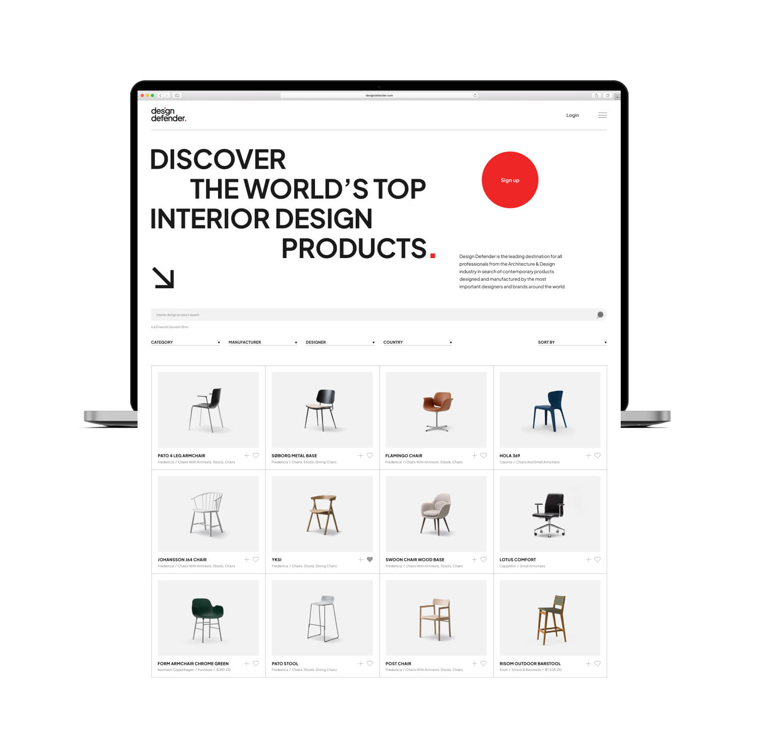
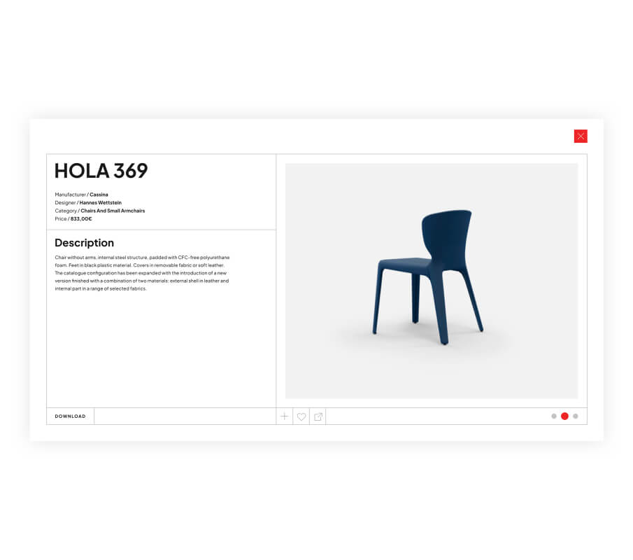
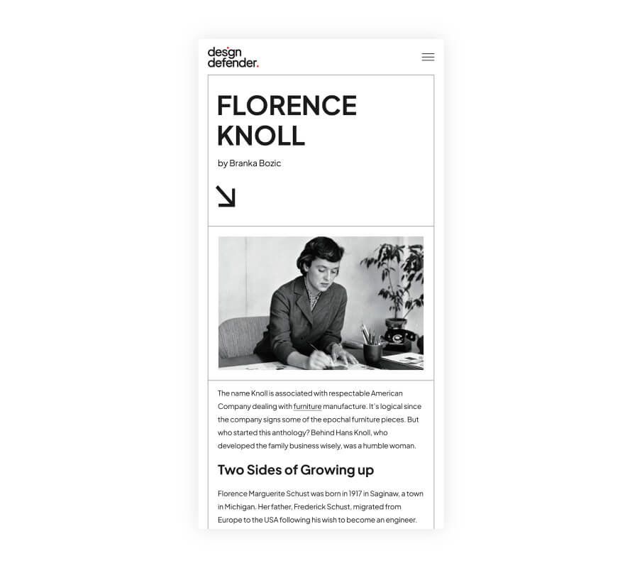
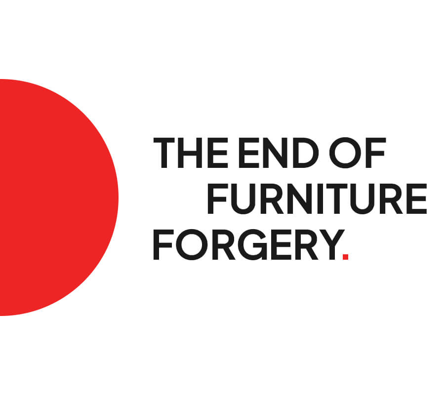
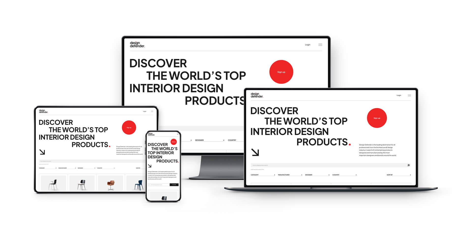
Design Defender leverages cutting-edge blockchain technology to safeguard original designs from forgeries, offering unparalleled protection to the global architecture and design community. The platform serves as a trusted resource for professionals seeking contemporary products created by the world’s most renowned designers and brands.
Design Defender required a distinctive, minimalistic visual identity and a simple yet effective website to resonate with its sophisticated audience. The solution needed to reflect their innovative use of blockchain technology while maintaining a professional and approachable aesthetic for architects, designers, and industry professionals worldwide.
Visual Identity Design: We developed a modern visual identity that embodies trust, innovation, and simplicity. The logo and supporting graphic elements emphasize clarity and professionalism, aligning with the platform’s commitment to authenticity and design protection.
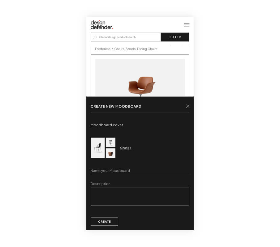
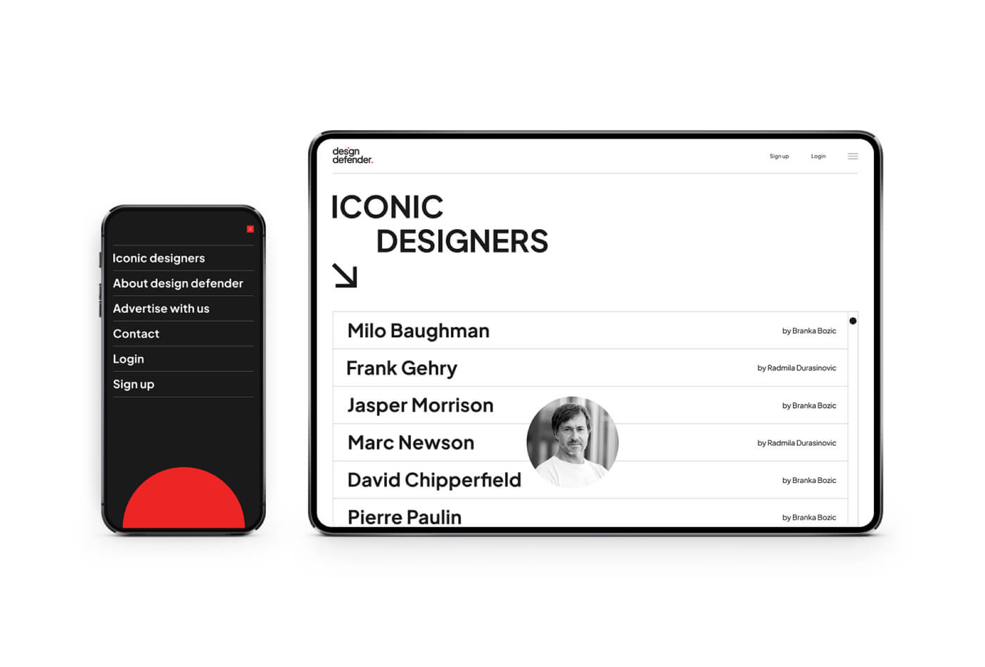
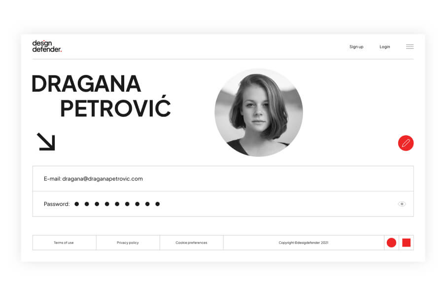
Website Design: The website was crafted to offer a seamless user experience, prioritizing simplicity and functionality. The intuitive interface ensures effortless navigation, enabling users to explore and discover contemporary designs and products efficiently.
UX/UI Focus: We emphasized a user-centered approach to UX/UI design, keeping in mind the target audience. The layout, typography, and visual hierarchy were meticulously curated to create a platform that feels as refined as the products it showcases.
The result is a distinctive brand identity and user-friendly website that positions Design Defender as a leading authority in design protection. By combining innovative blockchain technology with an elegant digital presence, the platform offers a trusted space for professionals to discover and safeguard original creations.
Fine Natural Cosmetics
online shop
Services:
E-commerce website,
UX, UI
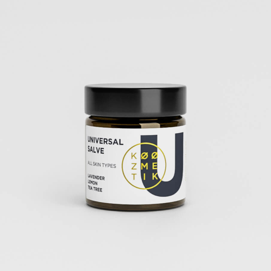
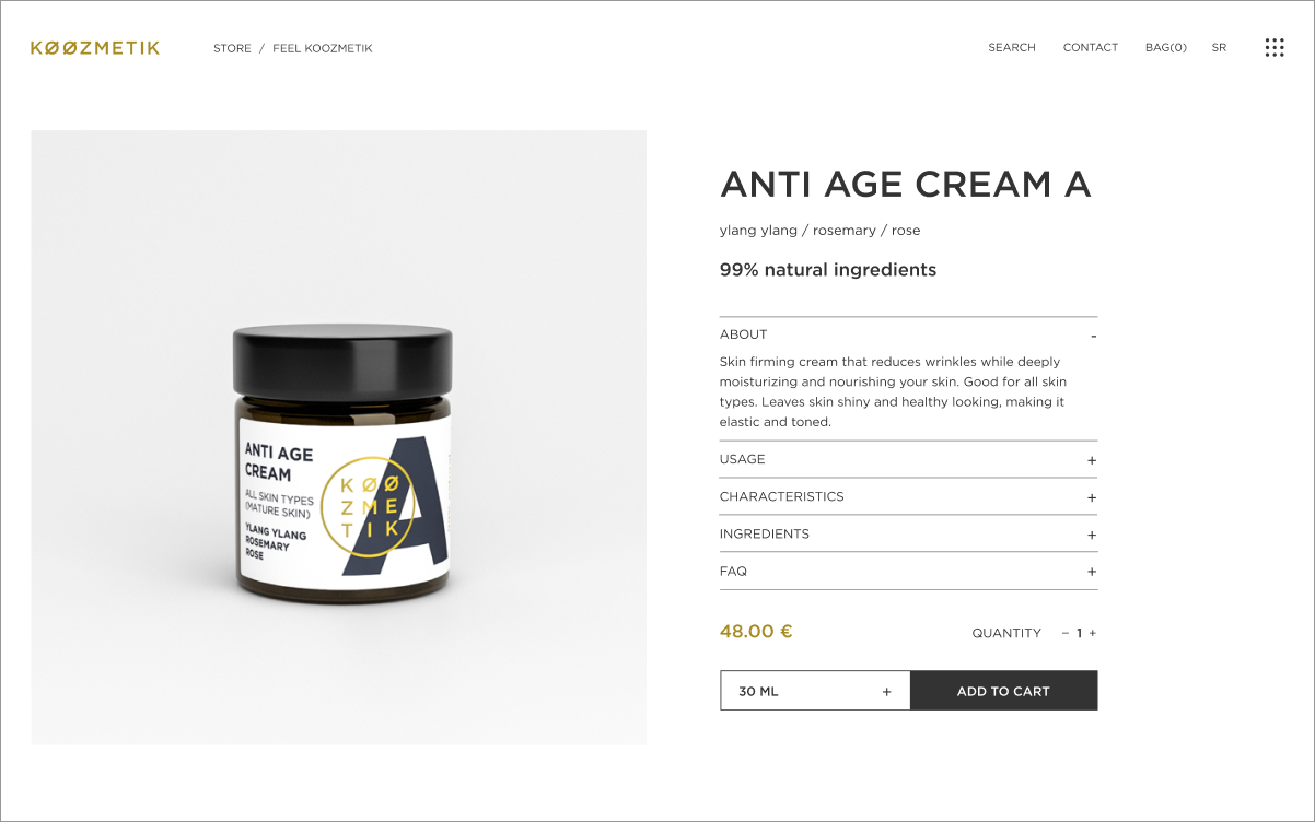
Discover Koozmetik, a premium natural skincare brand celebrated for its meticulous selection of the finest natural ingredients. With a commitment to quality and authenticity, Koozmetik offers a luxurious experience that resonates with skincare enthusiasts worldwide.
Koozmetik needed an e-commerce website that would reflect the sophistication of their brand while offering a seamless shopping experience. Our task was to build a custom-designed platform aligned with their visual identity, previously revamped through our branding and packaging redesign efforts. The challenge was to integrate beauty and functionality into an online shopping journey that would elevate the brand and drive sales.
Strategic Art Direction: Using our strategic and creative analysis skills, we developed a design concept centered on the “letter element,” a theme that had proven successful in Koozmetik’s identity and packaging redesign. This cohesive approach ensured consistency across all brand touchpoints, reinforcing their premium positioning.
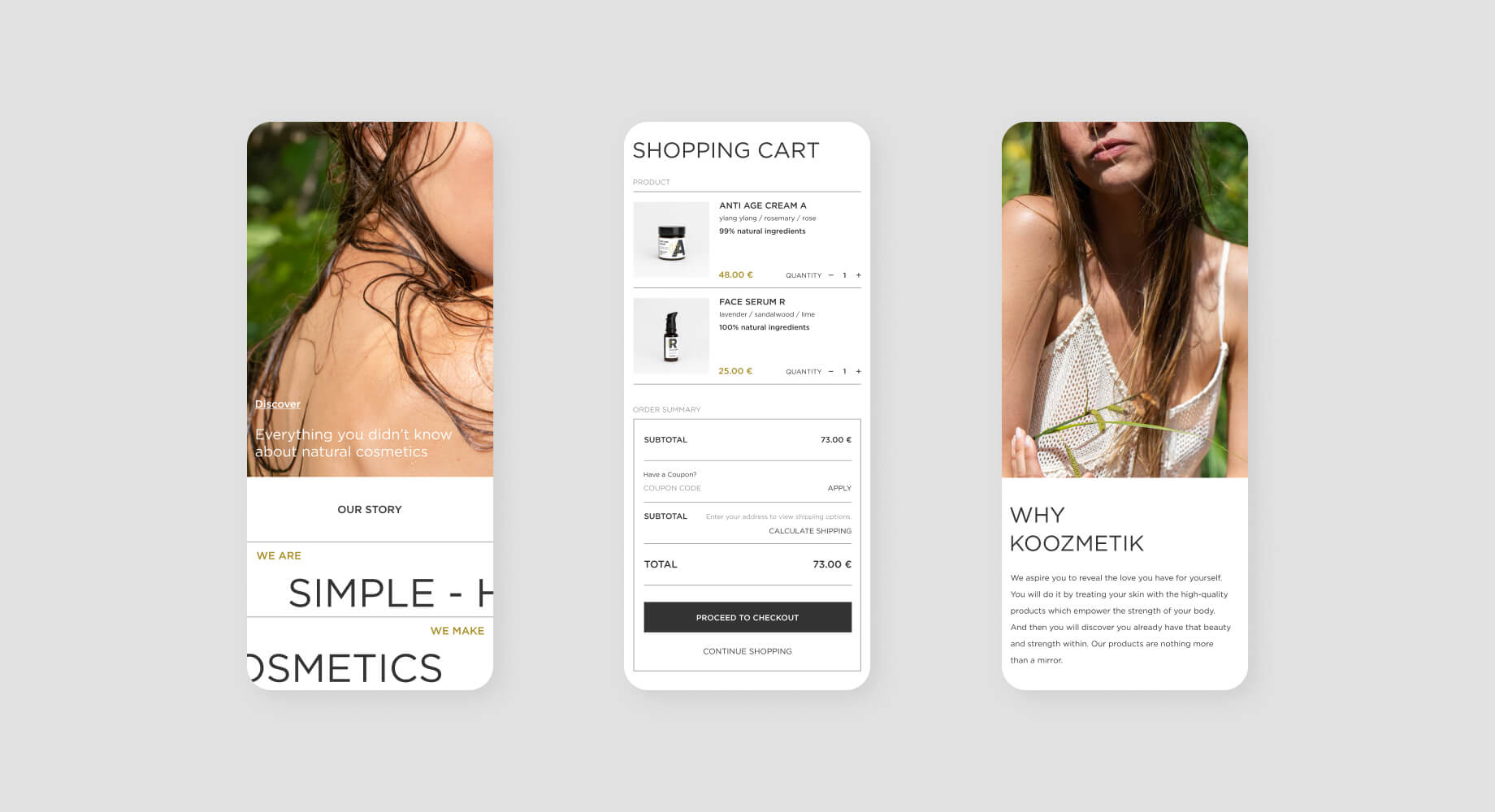
Custom E-Commerce Website Design: The website was crafted to provide users with a seamless and enjoyable shopping experience. From intuitive navigation to a visually stunning interface, every detail was designed to reflect the brand’s natural elegance and attention to quality.
User Experience (UX) and User Interface (UI): We placed significant emphasis on UX and UI, ensuring the website is as functional as it is beautiful. The layout, product pages, and checkout process were optimized to enhance usability and simplify the customer journey, ultimately driving conversions and sales growth.
The result is a visually striking e-commerce website that aligns perfectly with Koozmetik’s brand identity. The seamless shopping experience has led to a significant boost in sales, solidifying Koozmetik’s position as a leading name in the natural skincare industry.
With a design that reflects their dedication to quality and innovation, Koozmetik’s online presence is now as premium as their products.