Less Is More, or How Minimalism
Changed Graphic Design.

From fine arts, architecture, and graphic design, down to the way of life, there’s almost no form of human expression that has escaped the influence of minimalism. Although its roots can be traced as far back as to the 18th-century Zen philosophy values and principles, a global reputation and large-scale impact of minimalism are still notable today.
Graphic designers around the world have fully embraced this trend in the last decade, and the results have been more than encouraging. From start-ups to renowned brands on one side to customers and users on another, the profound interest in clean, elegant websites, classy Instagram feeds, and simple and effective UI/UX interfaces confirms the minimalist trend is truly evergreen.
Hype for minimal forms in graphic design
The origins of the minimalism movement in art and architecture of the Western societies date back to the mid-20th century in the USA, when minimalism was established in revolt against the dominance of abstract expressionism, alarming mass media expansion, and propagation of consumer mentality. “Form follows function”, one of the most popular mottos of the design world, was coined at this time, expressing the belief that design must always prioritize usability to aesthetics. Reducing colors, shapes, and forms to elemental simplicity was done with a goal of preserving their fundamental nature.
What this means is that, in its essence, minimalist design was intended to be purely functional. The goal was to empty the work of expression, emotion, and any unnecessary decorations. It was believed that a design product has reached its finest form when no element can be removed (or added) to make the result more complete and functional than it already is.
Fundamental principles of minimalism in graphic design
The first decade of the 21st century will undoubtedly go down in history as the time when the content of all shapes and sizes flooded our world to the point of distressing oversaturation. In a time when bombastic visuals compete to snatch our attention, the comeback of the graphic trend based on the “less is more” principle represents a long-awaited breath of fresh air.
Contrary to the widespread belief, however, there’s more to effective minimal design than meets the eye. The rules behind it may seem straightforward, but polishing the skill of telling a lot by saying a little is a process that takes years of exploration and practice.

Mastering simplicity
When it comes to graphic design, simplicity plays a crucial role in guiding the observer’s attention and helping them understand a product. The fewer elements there are in the mix, the better the chances that both of these goals will be accomplished.
A good-looking, yet functional design product must always be both pleasant to look at and easy to use. If any graphic element negatively affects the readability or usability of a design product, it must be either replaced or removed.
Appreciating neutrality
Minimalism prescribes a limited use of colors and asks for caution when it comes to exploring the possibilities within the color wheel. This, however, doesn’t mean that there are colors that are entirely off-limits in minimalist design. With a thought-out use of contrast, designers can apply touches of vivid colors in order to draw attention to the elements that are of the highest importance.
Minimalistic graphic design allows only simple, easy-to-read fonts. Expressive, bizarre, or in other ways striking typefaces are avoided at all costs, and combinations of different fonts are made very attentively, if at all.

Achieving balance
Visual harmony between all graphic elements is another vital aspect of minimalist design. Balance as a design objective corresponds to the relationship between shapes, colors, and negative spaces, which need to be appropriately distributed across the layout. To accomplish this, in website design, for example, graphic designers often use so-called grid systems that help align and control the positions of all important elements.
Establishing hierarchy
Visual hierarchy helps observers follow the planned trail of elements, letting them know which pieces of information to look at first, second, third, and so on. Design elements such as color, size, composition, and typography play a significant role in establishing hierarchy and assigning visual priorities.
Conquering negative space
One of the most intriguing design elements, especially important in minimalistic design, is the negative space. Although it’s most commonly white, it can be any other color as well. Minimalism prescribes planning for a lot of negative space in design, in order to help balance out and accentuate other hierarchically aligned design elements.
Why did distinguished brands embrace minimalist design?
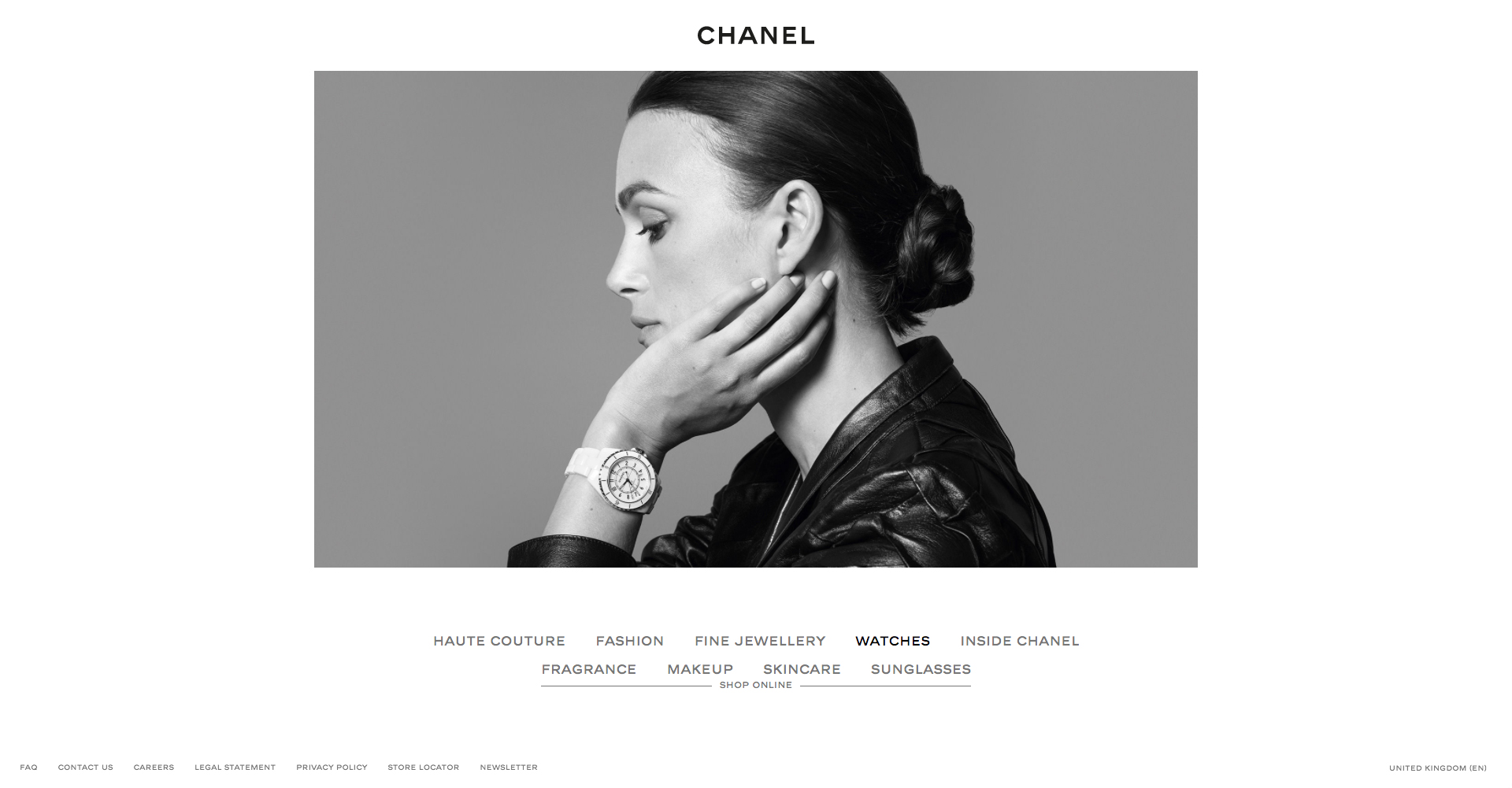
Although minimalism hasn’t overshadowed a plethora of other design trends out there, it’s certainly making its mark. Numerous esteemed brands, lead by examples such as Apple, Chanel, HP, and Dior, created visual identities to match the simplicity and sophistication they stand for, creating pure and elegant websites, minimalist Instagram feeds, and simple, yet stylish print materials.

Joining the minimalist design hype isn’t a decision that brands make just to stay fashionable and relevant. Simplicity has proven to be a trend that never goes out of style, which makes it attractive for brands and consumers alike. Minimalist design solutions are timeless and easily refreshed when needed, representing a solid ground for long-term brand identity consistency and recognition on the market.
When content is king, less is really more
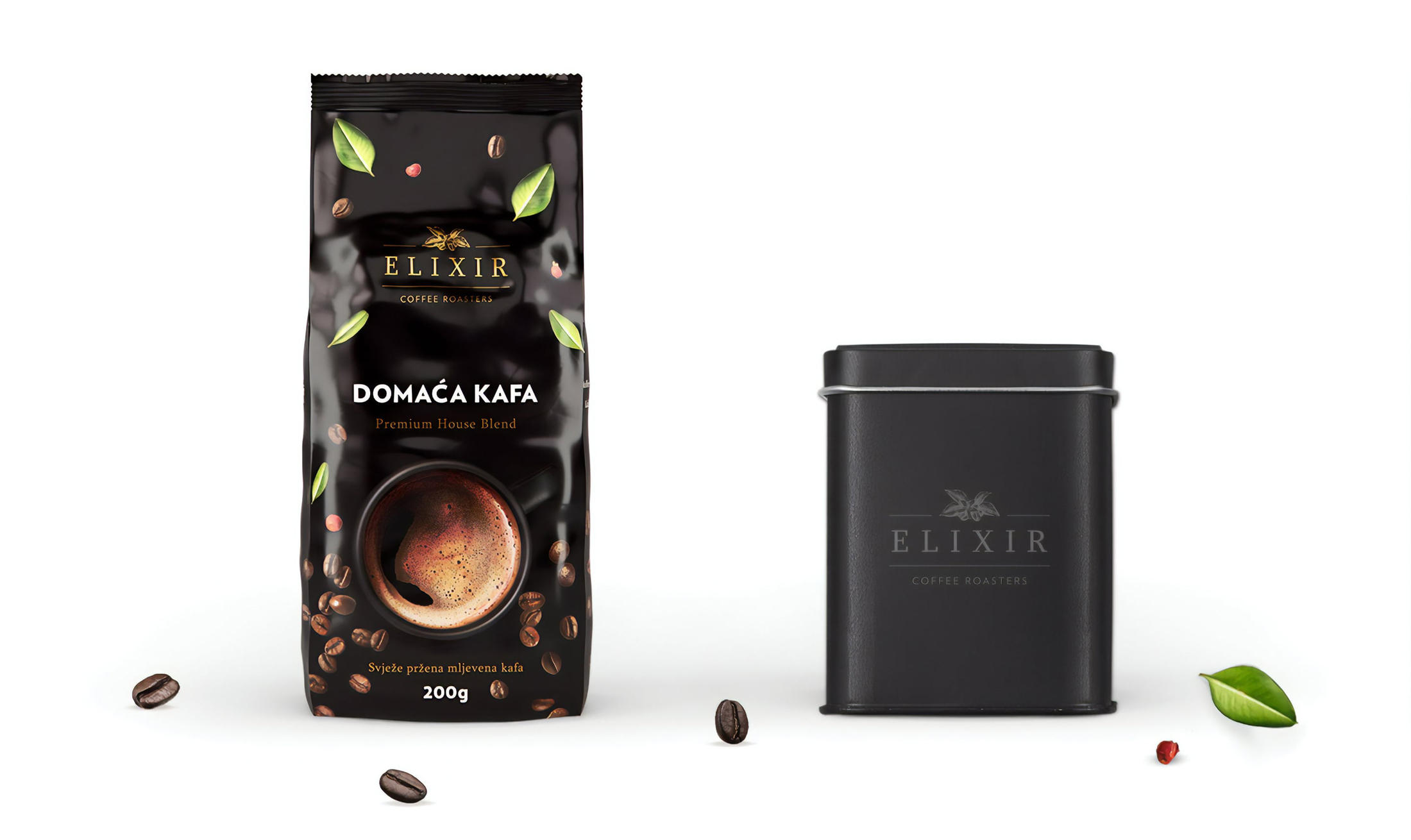
Minimalist design isn’t just ageless and appealing. It’s also very versatile and applicable on a large scale: From packaging and printed products to logos and websites, there is no area of graphic design that can’t use this trend to its benefit.
In a time when most consumers spend the majority of their time on smartphones, tablets, and laptops that get smaller and thinner by the year, readability and streamlined functionality are no longer welcome bonuses — they are the absolute necessities. Minimalist design brings clarity and straightforwardness that consumers crave for, helping brands rise among the profusion of competition focused on design trends based on bright, flashy, pretentious visual elements.
When it comes to web design, in a virtual world dominated by visual noise, minimalism opens a refreshing window to highlight what is necessary. It guides the user to what is important, improving user experience and the experience with the brand.
As the attention span of all audiences gets shorter and shorter, in order to stand out, the time has come to tone down, simplify, and seize the spotlight.
Written by Dunja Sretović, Content Strategist at April Studio